1
2
3
4
5
6
7
8
9
10
11
12
13
14
15
16
17
18
19
20
21
22
23
24
25
26
27
28
29
30
31
32
33
34
35
36
37
38
39
40
41
42
43
44
45
46
47
48
49
50
51
52
53
54
55
56
57
58
59
60
61
62
63
64
65
66
67
68
69
70
71
72
73
74
75
76
77
78
79
80
81
82
83
84
85
86
87
88
89
90
91
92
93
94
95
96
97
98
99
100
101
102
103
104
105
106
107
108
109
110
111
112
113
114
115
116
117
118
119
120
121
122
123
124
125
126
127
128
129
130
131
132
133
134
135
136
137
138
139
140
141
142
143
144
145
146
147
148
149
150
151
152
153
154
155
156
157
158
159
160
161
162
163
164
165
166
167
168
169
170
171
172
173
174
175
176
177
178
179
180
181
182
183
184
185
186
187
188
189
190
191
192
193
194
195
196
197
198
199
200
201
202
203
204
205
206
207
208
209
210
211
212
213
214
215
216
217
218
219
220
221
222
223
224
225
226
227
228
229
230
231
232
233
234
235
236
237
238
239
240
241
242
243
244
245
246
247
248
249
250
251
252
253
254
255
256
257
258
259
260
261
262
263
264
265
266
267
268
269
270
271
272
273
274
275
276
277
278
279
280
281
282
283
284
285
286
287
288
289
290
291
292
293
294
295
296
297
298
299
300
301
302
303
304
305
306
307
308
309
310
311
312
313
314
315
316
317
318
319
320
321
322
323
324
325
326
327
328
329
330
331
332
333
334
335
336
337
338
339
340
341
342
343
344
345
346
347
348
349
350
351
352
353
354
355
356 | #!/usr/bin/env Rscript
# Comcast modem power levels plotting script.
# Author: Eugenio Cilento
# Date: 09.16.2019
# Load libraries
library(ggplot2, warn.conflicts = FALSE)
library(scales, warn.conflicts = FALSE)
library(ggrepel, warn.conflicts = FALSE)
library(lubridate, warn.conflicts = FALSE)
library(dplyr, warn.conflicts = FALSE)
consts <- list(img_w = 14,
img_h = 8.5,
img_dpi = 320,
img_q = 30,
days = 6)
# ***************************************************************************************
# Get the data, clean it up and get it ready for use in the graph.
# ***************************************************************************************
# Read in the modem power levels from the text file.
pwr <- read.table("cm_modem_pwr_levels.txt")
pwr = pwr[c(-3,-5,-6,-8)] # Remove uneeded columns.
colnames(pwr) = c("Date","Time","UP","DW") # Let's give the columns some names.
pwr$DateTime <- paste(pwr$Date, pwr$Time) # Create a new timstamp column.
# Create a new column used for the facets. Basically to show the Days on the graph.
pwr$Dow <- strptime(pwr$DateTime, "%Y-%m-%d")
pwr$Dow <- format(pwr$Dow, "%m-%d %a")
pwr = pwr[c(-1,-2)] # Some more cleanup.
# Make that column an actual date time field
pwr$DateTime <- strptime(pwr$DateTime, "%Y-%m-%d %H:%M:%S")
pwr$DateTime <- as.POSIXct(pwr$DateTime, tz = "America/Chicago") # Convert to POSIXct type
pwr <- pwr[pwr$DateTime >= as.POSIXct(Sys.Date()-consts$days),] # Limit the data.
# When did the modem signal go outside of the acceptable range?
pwrovr <- pwr[which(pwr[,1] > 49 | pwr[,1] < 35 ),]
# Dataframe for ranges
dmax <- pwr %>% group_by(Dow) %>% summarise(Max = max(DateTime))
dmin <- pwr %>% group_by(Dow) %>% summarise(Min = min(DateTime))
dminmax <- merge(dmax,dmin,by = "Dow")
# Put in variables so we dont have to repeat code
dta = as.POSIXct(Sys.Date())
dtw = format(as.POSIXct(Sys.Date()), "%m-%d %a")
# ***************************************************************************************
# Beginning of the UPSTREAM graph script.
# ***************************************************************************************
# Dataframe for text labels for ranges
text_ann <- data.frame(UP = 49, DW = 5,
lab = "Packet Loss\nBegins: +49", DateTime = dta, Dow = dtw)
text_ann <- rbind(text_ann,
data.frame(UP = 35, DW = 5,
lab = "Recommended:\n+ 35 - 47", DateTime = dta, Dow = dtw))
hour(text_ann$DateTime) = 2 #position of text within facet
# Create the plot
gg <- ggplot(pwr, aes(DateTime, UP)) +
geom_point( # Points on a graph seem to work best for this type data.
color = "black",
size = .1
) +
facet_grid( # This gives the days in a nice column.
col = vars(Dow),
labeller = labeller(Dow = label_wrap_gen(5)), # Word rap the labels.
space = 'free',
scales = 'free',
switch = 'x'
) +
labs( # Needs some good titles and labels to make it easier to understand.
title="Cable Modem Upstream Power",
subtitle="Comcast Business Internet",
y="Upstream Power Level (dBmV)",
x="Time (Date & Hour in 24Hr format)",
caption= paste( # Timestamp the graph.
"International Assurance of TN, Inc. IT Department -",
Sys.time()
)
) +
geom_rect( # color the acceptable range so it stands out.
data = dminmax,
aes(
xmin = Min,
xmax = Max,
ymin = 35,
ymax = 47),
alpha = 0.2,
fill="green",
inherit.aes = FALSE
) +
geom_rect( # color the acceptable range so it stands out.
data = dminmax,
aes(
xmin = Min,
xmax = Max,
ymin = 47,
ymax = 49),
alpha = 0.2,
fill="red",
inherit.aes = FALSE
) +
geom_text( # add labels for the ranges
data = text_ann,
aes(x=DateTime, y=UP, label=lab),
vjust=-.2,
hjust=0,
size=2.5,
color= "black"
) +
geom_hline(yintercept=49, linetype="dashed", color = "red") +
geom_hline(yintercept=47, linetype="dashed", color = "green") +
geom_hline(yintercept=35, linetype="dashed", color = "green") +
coord_cartesian( # Set the y scale. The range of modem signal levels.
ylim = c(0, 60)
) +
scale_y_continuous( # Set where the lines show on the graph.
minor_breaks = seq(0 , 60, 1),
breaks = seq(0, 60, 10)
) +
scale_x_datetime( # Set the x scale based on the hour of the day.
breaks = pretty_breaks(), # Makes the hours fit nicely in a day.
expand = c(0, 0), # Brings the panel/facets together, seamless transition from day to day.
labels = date_format("%H", tz = Sys.timezone(location = TRUE)),
date_breaks = "2 hour",
date_minor_breaks = "1 hour"
) +
theme_bw() + # Start off with a base theme, then modify it.
theme(
panel.border = element_rect(
color = "dark gray"),
panel.spacing.x = unit(0,"line"),
strip.placement = "outside",
strip.text.x = element_text(
size = 6
),
panel.grid.major = element_line(
color = "light gray"),
panel.grid.minor = element_line(
color = "light gray"
),
axis.text.x = element_text( # Hour of the day
size = 6,
angle = 90,
vjust = 0.5,
hjust = 0.5),
axis.line = element_line( # Make the axis stand out.
color = "darkblue",
size = 1,
linetype = "solid")
)
if (dim(pwrovr)[1] != 0) { # Make sure we have out of range plots before adding them
gg = gg +
geom_text_repel( # Label the out-of-range plots
aes(label = paste(hour(DateTime),":", minute(DateTime),"-",UP)),
pwrovr,
size = 2,
color = "red"
)
}
# Save the graph to a JPEG file. High resolution allows more clarity and printability.
ggsave("cm_modem_up_pwr_levels.jpg",
width = consts$img_w,
height = consts$img_h,
dpi = consts$img_dpi,
quality = consts$img_q,
limitsize = FALSE)
# ***************************************************************************************
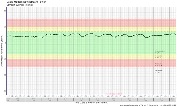
# Beginning of the DOWNSTREAM graph script.
# ***************************************************************************************
# Dataframe for text labels for ranges
text_ann2 <- data.frame(UP = -6, DW = 5,
lab = "Recommended:\n-7 to 7", DateTime = dta, Dow = dtw)
text_ann2 <- rbind(text_ann2,
data.frame(UP = -9, DW = 5,
lab = "Acceptable:\n+- 7 to 10", DateTime = dta, Dow = dtw))
text_ann2 <- rbind(text_ann2,
data.frame(UP = -14, DW = 5,
lab = "Maximum:\n+- 10 to 15 ", DateTime = dta, Dow = dtw))
text_ann2 <- rbind(text_ann2,
data.frame(UP = -18, DW = 5,
lab = "Out of Spec:\n> +-15 ", DateTime = dta, Dow = dtw))
hour(text_ann2$DateTime) = 2 #position of text within facet
# Filter into a new table the out-of-range instances.
pwrovr <- pwr[which(pwr[,2] > 10 | pwr[,2] < -10 ),]
# Generate the downstream graph. Identical to upstream but with different ranges.
gg <- ggplot(pwr, aes(DateTime, DW)) +
geom_point(
color = "black",
size = .1
) +
facet_grid(
col = vars(Dow),
labeller = labeller(Dow = label_wrap_gen(5)),
space = 'free',
scales = 'free',
switch = 'x'
) +
coord_cartesian(
ylim = c(-30, 20)
) +
scale_y_continuous(
minor_breaks = seq(-30 , 20, 1),
breaks = seq(-30, 20, 10)
) +
labs(
title="Cable Modem Downstream Power",
subtitle="Comcast Business Internet",
y="Downstream Power Level (dBmV)",
x="Time (Date & Hour in 24Hr format)",
caption= paste(
"International Assurance of TN, Inc. IT Department -",
Sys.time()
)
) +
geom_text( # write the labels for the ranges
data = text_ann2,
aes(x=DateTime, y=UP, label=lab),
vjust=.3,
hjust=0,
size=2.5,
color= "black"
) +
geom_hline(yintercept=-15, linetype="dashed", color = "red") +
geom_hline(yintercept=-10, linetype="dashed", color = "yellow") +
geom_hline(yintercept=-7, linetype="dashed", color = "green") +
geom_hline(yintercept=7, linetype="dashed", color = "green") +
geom_hline(yintercept=10, linetype="dashed", color = "yellow") +
geom_hline(yintercept=15, linetype="dashed", color = "red") +
geom_rect( # color the acceptable range so it stands out.
data = dminmax,
aes(
xmin = Min,
xmax = Max,
ymin = -7,
ymax = 7),
alpha = 0.2,
fill="green",
inherit.aes = FALSE
) +
geom_rect( # color the acceptable range so it stands out.
data = dminmax,
aes(
xmin = Min,
xmax = Max,
ymin = -10,
ymax = -7),
alpha = 0.2,
fill="yellow",
inherit.aes = FALSE
) +
geom_rect( # color the acceptable range so it stands out.
data = dminmax,
aes(
xmin = Min,
xmax = Max,
ymin = 7,
ymax = 10),
alpha = 0.2,
fill="yellow",
inherit.aes = FALSE
) +
geom_rect( # color the acceptable range so it stands out.
data = dminmax,
aes(
xmin = Min,
xmax = Max,
ymin = -15,
ymax = -10),
alpha = 0.2,
fill="red",
inherit.aes = FALSE
) +
geom_rect( # color the acceptable range so it stands out.
data = dminmax,
aes(
xmin = Min,
xmax = Max,
ymin = 10,
ymax = 15),
alpha = 0.2,
fill="red",
inherit.aes = FALSE
) +
scale_x_datetime(
breaks = pretty_breaks(),
expand = c(0, 0),
labels = date_format("%H", tz = Sys.timezone(location = TRUE)),
date_breaks = "2 hour",
date_minor_breaks = "1 hour"
) +
theme_bw() +
theme(
panel.border = element_rect(
colour = "dark gray"),
panel.spacing.x = unit(0,"line"),
strip.placement = "outside",
strip.text.x = element_text(
size = 6
),
panel.grid.major = element_line(
colour = "light gray"),
panel.grid.minor = element_line(
color = "light gray"
),
axis.text.x = element_text(
size = 6,
angle = 90,
vjust = 0.5,
hjust = 0.5),
axis.line = element_line(
colour = "darkblue",
size = 1,
linetype = "solid")
)
if (dim(pwrovr)[1] != 0) { # Make sure we have out of range before plotting
gg = gg +
geom_text_repel( # Label the out-of-range plots
aes(label = paste(DateTime, "-", DW, "dBmV")),
pwrovr,
size = 2,
color = "red"
)
}
# Save graph to file.
ggsave("cm_modem_dwn_pwr_levels.jpg",
width = consts$img_w,
height = consts$img_h,
dpi = consts$img_dpi,
quality = consts$img_q,
limitsize = FALSE)
|